
Why nobody is clicking your YouTube thumbnails
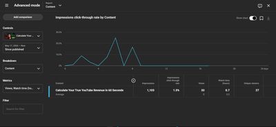
Let’s be completely honest with ourselves here. You can stay up all night scripting, positioning your ring light, and editing a video until your eyes are bloodshot. You buy data, you upload the video, and you sit back waiting for the views to pour in. But then, 24 hours later, you check your dashboard and see double-digit views. It is deeply frustrating, right?
The truth is simple: if your thumbnail is not catching attention, nobody is ever going to find out how great the actual video is. On YouTube, your thumbnail is the front of your shop. If the storefront looks uninviting, cluttered, or confusing, people will just walk past. You have less than 3 seconds to stop someone from scrolling past your video on their phone screen. If you fail that 3-second test, your video is dead on arrival.
Before I even started building tools for YouTube creators, I was heavily into graphic design. Fun fact is, I am still creating graphics for different companies today as part of my social media management packages. Back then, when I designed thumbnails for my clients, I always made sure they were shiny, premium, and glowing. I was designing to impress the clients, not the actual viewers on the platform! But when I realized those gorgeous designs were visually appealing to the eye but bringing in zero clicks, I knew I had to drop the "fine art" and completely change my strategy based on how human beings actually process visuals on a feed.
Getting people to click isn’t about luck, and it is definitely not about begging people in the comments section. It is pure human psychology mixed with common sense. Let’s break down how the human brain processes images on a live feed, and how you can style your thumbnails to start bringing in the numbers your hard work deserves.
1. Visual Hierarchy: Stop Making Your Thumbnails Too Noisy
When someone is scrolling through YouTube on their phone, their brain is scanning things at lightning speed. They do not have the time to sit down and analyze what is happening in your image. The human eye follows a very strict path when looking at a thumbnail: it looks at the face or main subject first, then it reads the big text, and finally, it notices the background.
If your thumbnail has too many things happening at the same time—3 different arrows, 5 floating emojis, and a busy background—it creates massive visual chaos. The brain gets tired trying to figure it out and just skips it. This is why a clean, minimalist style always wins.
- The Contrast Rule: You want your main subject to stand out completely from everything else. If your background is dark or slightly blurred, your main subject needs to be sharp, well-lit, and bright.
- The Mobile Test: Before you export your final image, shrink it down on your laptop until it is the size of a small coin. If you cannot tell exactly what the video is about at that tiny size, delete it and start again. If it doesn't work on a tiny phone screen, it won't work on the app.
2. Faces and Emotions: The Eye Contact Secret
Have you noticed that the biggest creators on the planet almost always put their faces on their thumbnails? There is a biological reason for that. As humans, we are naturally wired to look at faces, and specifically, our eyes automatically lock onto other eyes to understand what is happening.
A lot of people just take a random screenshot from the timeline where their mouth is half-open and they look exhausted, slap it on the canvas, and expect miracles. It doesn't work that way.
I’ve managed dozens of social media accounts and YouTube channels over the years, and I can tell you for a fact: data doesn't lie. My team and I ran a series of A/B tests comparing generic graphics with no face against designs that featured a clear human profile. Every single time, the thumbnail with the face won by a landslide. Why? Because a human face instantly projects real, relatable emotions like deep focus, confusion, or pure excitement.
If your video is about a mistake that cost you money, your thumbnail face should look genuinely stressed or shocked. If it’s about a shortcut or a major win, look confident. Exaggerate the expression a bit. Your face should tell the viewer exactly how they are going to feel when they watch the video.
3. Text on Thumbnails: The 3-Word Law
Please, let's stop repeating the video title inside the thumbnail image. It is a complete waste of prime real estate. The viewer can already read the actual title right below your video. The text on your thumbnail should be a hook—something that adds tension, creates a curiosity gap, or makes them ask a question.
Keep it to 3 or 4 words maximum. If you try to write a whole sentence, nobody will read it while scrolling.
- Font Choice: Use thick, bold, clean fonts that don't have unnecessary decorations or thin lines.
- Readability: Always use subtle drop shadows or dark outlines behind your text. If your text blends into your background colors, people will just scroll past because it takes too much physical effort to read.
The Bottom Line: A bad thumbnail kills your Click-Through Rate (CTR). When your CTR drops, your views drop, and your revenue goes down with it. If you want to see how much potential money you are leaving on the table from low views caused by bad packaging, you can use the Income Calculator on TubeUtility to see how even a small bump in your click-through traffic changes your actual earnings.
📝 The Minimalist Thumbnail Plan
(Copy this simple checklist whenever you are planning your next video design so you don't overcomplicate the process.)
- The Core Emotion: What is the one specific feeling of this video? (e.g., Shock, Relief, Curiosity)
- The Main Subject: What is the absolute biggest object in the image? (e.g., A clean cutout of my face or a clear screenshot of a specific dashboard)
- The Background: Is it simple enough? Can I blur it slightly so the main element pops?
- The 3-Word Hook: What short text am I adding? (e.g., "Don't Do This", "Finally Fixed", "They Lied?")
- The Color Check: Did I avoid using too much white or pure YouTube red so my design doesn't blend into the app layout?
4. Let's Answer Some FAQ
Q: What colors actually make people click the most?
A: Colors like bright blue, neon green, and deep yellow work incredibly well because they naturally stand out against both the dark mode and light mode interfaces of the YouTube app. Try to avoid making your entire thumbnail black, white, or standard red, because your video will just blend directly into the platform itself.
Q: What if I run a channel where I don't want to show my face?
A: If you run a faceless channel or do pure coding and tech tutorials, that is perfectly fine. Instead of a face, make sure your main subject is a very high-quality, recognizable brand logo, a clean UI screenshot, or a bold visual icon that instantly tells the viewer what the tool or topic is about.
Q: Can I change a thumbnail after the video is already live?
A: Yes, and you absolutely should if the numbers are bad. If you upload a video and notice after 4 to 5 hours that your impressions are high but the views are completely flat, it means people are seeing it but choosing to scroll past. Swap the thumbnail or change the text immediately and watch if the curve starts moving up.
Q: Does a great thumbnail mean my video will automatically perform well?
A: No, it’s a two-part game. The thumbnail gets them through the door. But if your video intro is slow, repetitive, or boring, they will leave after 10 seconds. A great thumbnail gets you a high CTR, but your editing and pacing are what keep them there to build your actual watch time.
5. Personal Summary: Design is Fine, but Data is Final
At the end of the day, my guy, a beautiful thumbnail is completely useless if it doesn't make someone stop their thumb and click. Don't just design something because it looks artistic, complex, or fancy to you. Design for the guy who is tired, riding on a noisy bus, and casually flipping through his phone screen.
Treat your visuals like a core part of your business and optimization strategy, not just an afterthought you rush through right before clicking the publish button.
Stop leaving your channel growth to guesswork. Keep your designs clean, focus on real human emotions, use the calculators over on TubeUtility to project what your traffic is actually worth, and let's start running your channel like the real business it is.
🚀 Next Step in Your Creator Workflow
To stop guessing your worth and start charging brands what you are actually valued at, use our free tools. Use the Brand Deal Calculator right now to generate a data-backed pricing report for your next sponsor pitch.